Branding Design
Brand identity, logos, color palettes, and brand guidelines, goodies …
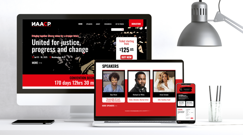
The NAACP project
This project began with a clear challenge: transform an existing identity into a powerful, unified brand experience capable of mobilizing, inspiring, and engaging a wide audience.
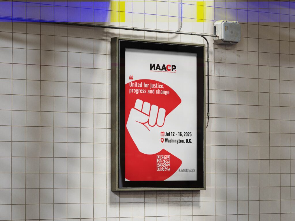
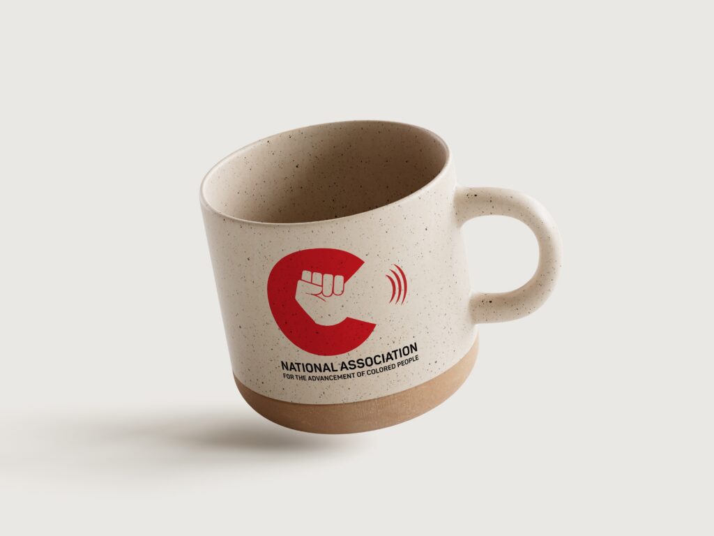
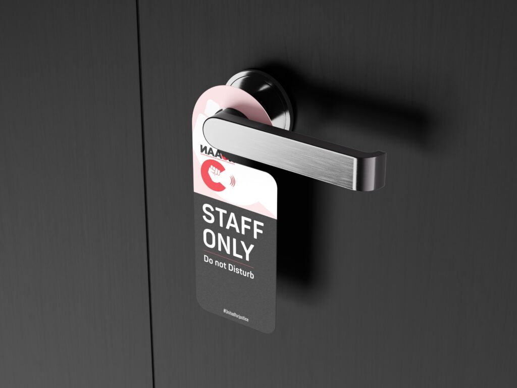
The event already carried a strong message, but its visual identity lacked consistency and impact across touchpoints. The goal was not just to redesign a logo, but to build a complete and cohesive brand system. The new direction focused on clarity, boldness, and symbolism. The raised fist became the central visual element, embodying unity, strength, and collective action, while the red and white palette reinforced urgency, visibility, and emotional resonance.
From there, the identity was deployed across a full ecosystem of brand assets. Every element was designed to speak the same visual language: badges that reinforce belonging, posters that capture attention in public spaces, merchandise like mugs and t-shirts that extend the message beyond the event, and a website mockup that ensures digital consistency. Each touchpoint was carefully aligned to create a seamless and recognizable experience.
More than a redesign, this project demonstrates the ability to think beyond a logo and build a brand that lives, evolves, and connects with people across multiple contexts. It is about creating not just visuals, but a system that amplifies a message and turns it into a shared movement.
Let’s work together
Others projects